Kumo Study is a study management platform providing an all-in-one toolkit helping university students focus on their studies.
The project's goal was to enhance the current user experience, to ensure Kumo provide an inclusive digital product that caters to the unique needs of university students with ADHD, enhancing their ability to focus and achieve their study goals efficiently.
Based on Nielsen's usability heuristics, the site faced issues in:
Recognition over recall: Insufficient book details made user decisions hard.
User control & freedom: From long login procedures to a non-intuitive navigation system, users had some difficulty moving through the site.
Aesthetic & minimalist design: Despite a minimalist design, unnecessary categories and confusing navigation items created clutter.
Jeff is an undergrad completing a philosophy major at Melbourne University, he is interested in buying a science fiction novel about artificial intelligence and the impact of technology. However, he soon discovers there are numerous books available on the topic with different perspectives, some more contemporary than others. He is careful about what he purchases and wants to make sure he buys whichever version is well-regarded by reviewers and has a more conversational tone that speaks to current issues.
For users like Jeff, the website's lack of comparative features, detailed reviews, and a clear navigation system made finding and buying books cumbersome. These inefficiencies might divert them to platforms like Goodreads or Amazon, risking potential sales for Paperback Books.
Walking in Jeff’s shoes, the process of buying books online became clearer. The following pain points and challenges surfaced during the user journey:
The site does not facilitate finding similar books without extensive searching and navigation.
Jeff could not find similar books without toggling through multiple pages.
There's a lack of tools to compare books once found.
The need to compare books would drive him to external sources that offer reviews and detailed descriptions where he might find other books or get distracted and abandon his purchase.
The website doesn't reflect the in-real-life shop's ethos and aspirations.
Conducted to understand the e-commerce book market and identify improvement areas for Paperback Books, comparing it with major retailers like Amazon, Dymocks, Readings, Kinokuniya, and Ariel.
Navigation System:
Identified that Paperback's alphabetized list was less effective than competitors' contextual navigation, which offers suggestions based on user history and preferences.
Cross-Industry Inspiration:
NTS.live's tree-pane menu and breadcrumb tags for nuanced selection.
JB Hifi’s tick box selection and product comparison matrix.
The competitive analysis shed light on Paperback's gaps and provided a roadmap for improvement. By combining industry best practices with innovative solutions, the redesign aims to enhance user satisfaction, drive sales, and keep users engaged on the site.
Some key solutions emerged:
Implementing faceted search, categories, subgenres, and filters (themes, ratings, format, topics).
A better-structured sidebar menu with an attribute-based breadcrumb system including thematic tagging and tree pane or accordion elements that can display thematically similar books together.
Alongside reviews/rating systems, a comparison matrix can help users simultaneously compare two or more books.
To ensure that the revamped category titles would resonate with the users, a card sorting activity was conducted using the Optimal Workshop website. With input from seven participants, the activity led to the development of new intuitive categories. This collaborative approach ensured the updated categories truly reflected user preferences and expectations.

A new site map was developed in line with the results of the card sorting exercise and including simplified titles.
Initial Sketches:
Translated competitive analysis insights into tangible designs with sketching, visualizing layouts and navigation styles.
Refined sketches with continuous user feedback, serving as blueprints for the design.
Wireframing:
Developed digital wireframes from sketches, focusing on refining the user journey.
Integrated features like refined navigation and detailed product descriptions, enhanced by user feedback for seamless user experience.
Prototyping:
Built interactive prototypes from the wireframes to test functionality and user interaction.
Conducted user testing with these prototypes to gather real-time feedback, ensuring the final design met user needs and expectations.
Here's the current iteration of our prototype, which incorporates user feedback and improved features to enhance the overall user experience and functionality.
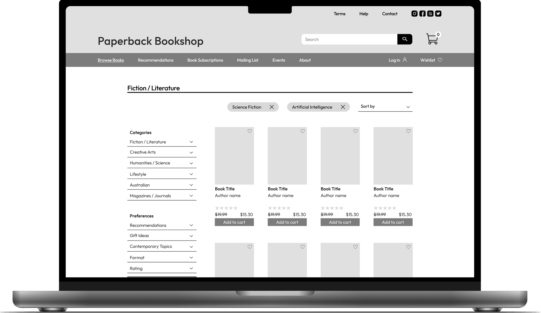
Enhanced Filtering System:
Expanded sidebar filtering for precise search criteria.
New categories like "Fiction / Literature", "Creative Arts", and "Humanities / Science".
Added preferences such as "Recommendations", "Gift Ideas", and "Contemporary Topics".
Tagging Feature for Navigation:
Tagging system at the top of the browsing page for easy navigation.
Tags like "Science Fiction" and "Artificial Intelligence" for intuitive search refinement.
Improved Product Display:
Displays title, author, star rating, price, and add-to-cart option.
Provides essential book information at a glance.
Wishlist Feature:
Users can save books for later consideration.
Detailed view in Wishlist with a "Compare" option.
Product Comparison Tool:
Inspired by JB Hifi, allows side-by-side book comparison.
Integrated Breadcrumb Navigation:
New design includes both location-based and attribute-based breadcrumb systems.
Responsive Design Elements:
Modular and adaptive design for consistent cross-device experience.
Consolidated Footer:
Organized footer with contact details, subscription options, and important links.
In conclusion, the improvements made to the Paperback Bookshop website aim to provide an intuitive, efficient, and enjoyable browsing and shopping experience. The combination of enhanced navigation tools, detailed product displays, and interactive features ensures users can find and compare books with ease, ultimately driving increased user satisfaction and potential sales.