Rowan James Moyle
UX Designer
Rowan James Moyle - UX Designer
Paperback Bookshop
Empowered Browsing: Tailoring to the Tasteful Reader
Paperback Bookshop
Empowered Browsing: Tailoring to the Tasteful Reader
Paperback Bookshop
Empowered Browsing: Tailoring to the Tasteful Reader
Paperback Bookshop
Empowered Browsing: Tailoring to the Tasteful Reader
Role
Lead UX Designer
Duration
2 Week Sprint
September
2023
Tools
Figma
Figjam
Optimal Sort
Overview
Established in the 1960s, Melbourne's Paperback Bookshop has grown from a paperback specialist to a beloved spot for classics, new releases, and a vibrant book-loving community.
Meanwhile, the internet has greatly expanded access to information and fostered unique online communities, leading many readers to seek out books for their niche content and their quality. Recognising this shift, the shop should adapt to these trends and cater to modern readers with diverse literary interests.
My Role
Working independently, I redesigned the Paperback Bookshop's website, aiming to enhance the overall user experience. This project involved catering to a unique user group termed 'careful critics' – discerning readers who seek books for their specific content and quality. I created an intuitive, user-friendly interface that both simplifies navigation, and highlights the Bookshop’s diverse and niche selections. The redesign aimed to bridge the gap between the physical charm of this small bookstore and the digital convenience sought by quality-conscious readers browsing online.
Working independently, I redesigned the Paperback Bookshop's website, aiming to enhance the overall user experience. This project involved catering to a unique user group termed 'careful critics' – discerning readers who seek books for their specific content and quality. I created an intuitive, user-friendly interface that both simplifies navigation, and highlights the Bookshop’s diverse and niche selections. The redesign aimed to bridge the gap between the physical charm of this small bookstore and the digital convenience sought by quality-conscious readers browsing online.
(Use larger device like a tablet or computer for more in depth information about this project).
Project Timeline
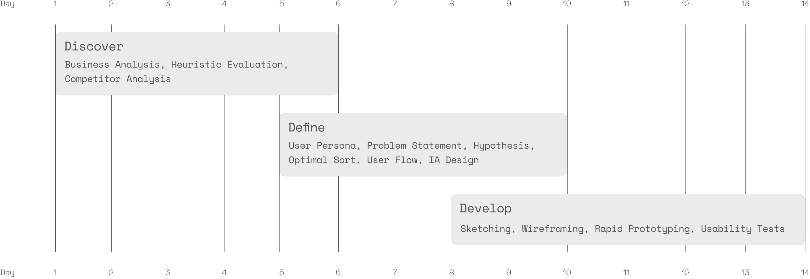
Discovery Phase: Analysing the Market and Evaluating the Site
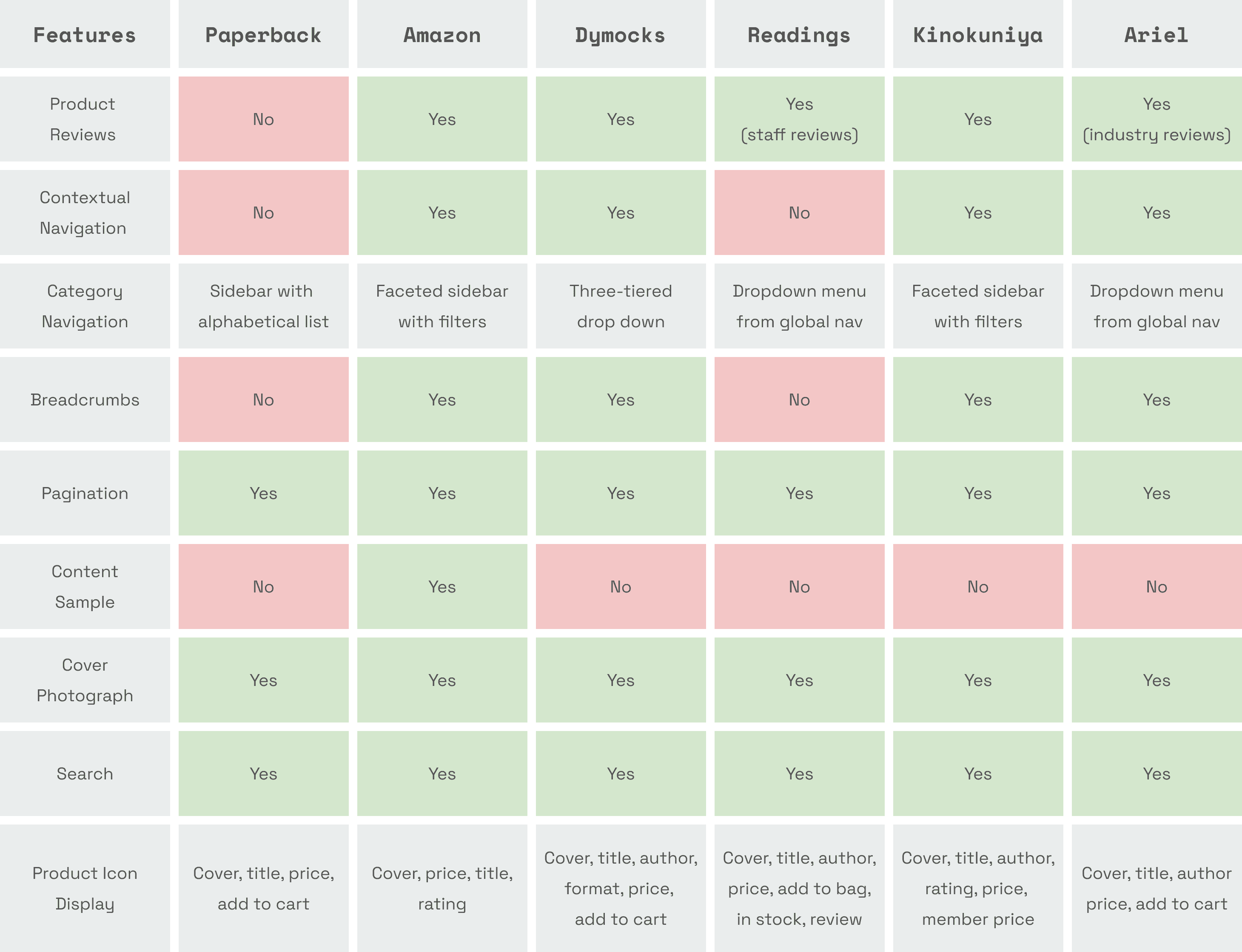
My journey began with in-depth market research. I looked briefly at trends impacting the sale of books, heightened by the pandemic’s push toward online retail. I then completed a competitive analysis, unpacking the key UI features of various e-commerce bookstores, including both large and small retailers, from industry giants like Amazon to more specialised sellers with physical stores like Ariel and Readings. My intention was to benchmark Paperback against the standard practices of other retailers, to better understand what users expect and areas for improvement. I also gained some cross-industry inspiration, when I came across JB Hifi’s tick box selection and product comparison matrix, which seemed like the perfect UI feature for allowing users to compare products.
Paperback's website lacks several common features found across numerous other e-commerce sites, including both small retailers and industry giants:
No product reviews for customer feedback.
A lack of contextual navigation for book discovery.
A basic alphabetical sidebar, not user-friendly faceted sidebar with filters
No breadcrumbs, making site navigation more difficult.
No book previews with content samples.
A simple product display, without detailed information like ratings or stock status.
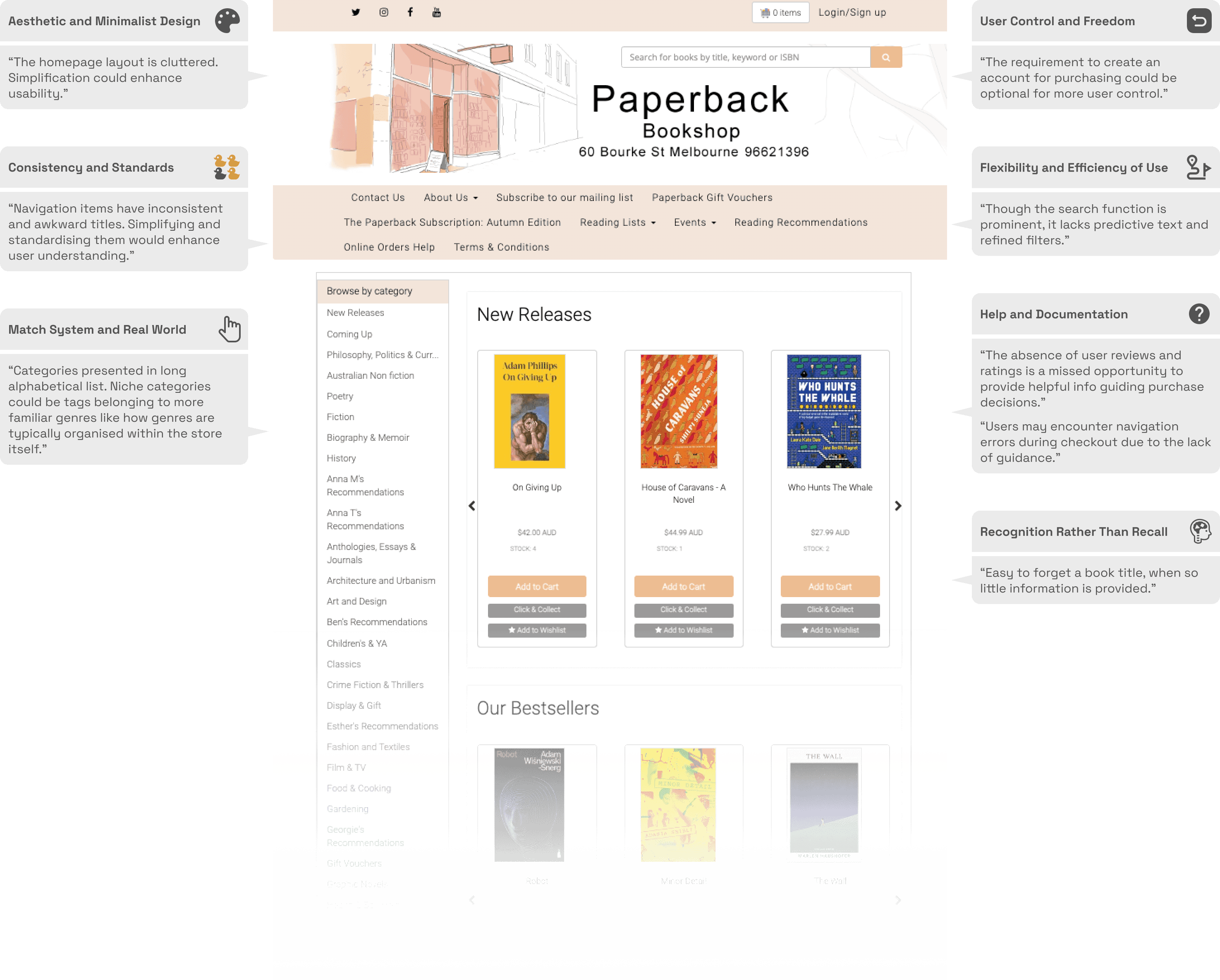
Using Jakob Nielsen’s 10 usability heuristics for user interface design, I analysed the current site's performance and made several key observations:
Defining a More Comprehensive User Persona
Next, I elaborated on the brief's user archetype, adding key details to make it easier to empathise and immerse myself in the user's mindset when engaging with the current site.
User Flow
Putting myself in Jeff’s shoes, the process of discovering a product to purchase became clearer. The following pain points and challenges surfaced when developing the following user flow:
The site does not facilitate finding similar books without extensive searching and navigation.
The user could not find similar books without toggling through multiple pages.
There's a lack of tools to compare books once found.
The need to compare books would drive him to external sources that offer reviews and detailed descriptions where he might find other books or get distracted and abandon his purchase.
Clarifying the Way Forward
Problem
For users like Jeff, the website's lack of comparative features, detailed reviews, and a clear navigation system significantly impedes the book-finding and purchasing process. Addressing these inefficiencies is critical to prevent users from turning to platforms like Goodreads or Amazon, a trend that could result in a measurable decrease in sales for Paperback Bookshop.
Hypothesis
If the Paperback Bookshop website integrates more robust comparative features, detailed book reviews, and a clearer navigation system, then it will ease the book-finding and purchasing process for users like Jeff. This improvement is expected to reduce the rate at which users turn to alternative platforms like Goodreads or Amazon, thereby potentially increasing the website's conversion rate and overall sales.
Card Sorting with Optimal Sort
Following the insights gained in the discover and define phase, I aimed to incorporate several key solutions into my designs. These included implementing a faceted search system with comprehensive categories, subgenres, and filters like themes, ratings, and formats. I also planned to revamp the sidebar menu for better structure, integrating an attribute-based breadcrumb system with thematic tagging. This would allow for a more intuitive display of thematically similar books. Additionally, to aid in decision-making, I intended to introduce a reviews and ratings system, complemented by a comparison matrix, enabling users to compare multiple books simultaneously.
However, before I could start sketching out my ideas, I needed to establish how to consolidate the alphabetical genre list. I had to figure out a way to group these diverse, niche book categories into broader, more universally recognised genres. For this purpose, a card sorting activity was conducted using Optimal Workshop's 'Optimal Sort' tool. With input from seven participants, I was able to determine new intuitive categories. The image below shows a similarity matrix - a visual representation of the connections between participant responses provided by Optimal Sort. By looking at the responses individually and collectively I was able to the create a new site map.
The Result: A New Site Map
The new site map reflected the diverse categories' amalgamation into a cohesive structure, a direct outcome of insights gained from the card sorting activity. This approach streamlined navigation and enhanced user experience by intuitively grouping related topics under more general, accessible headings. Here is a simple representation of the nav items I determined will be visible on the new website.
Developing the New Site
I was finally ready to start iterating and sketching out some ideas. My sketches, visualising layouts and navigation styles, were continuously refined with user feedback. I developed digital wireframes from them, focusing on refining the user journey and integrating features like enhanced navigation and detailed product descriptions, further improved by user feedback. Finally, I built interactive prototypes from these wireframes to test functionality and user interaction.
Current Prototype
The annotated wireframes below illustrate the new website prototype, and how it perfectly caters to the unique needs of 'Careful Critics' like Jeff.
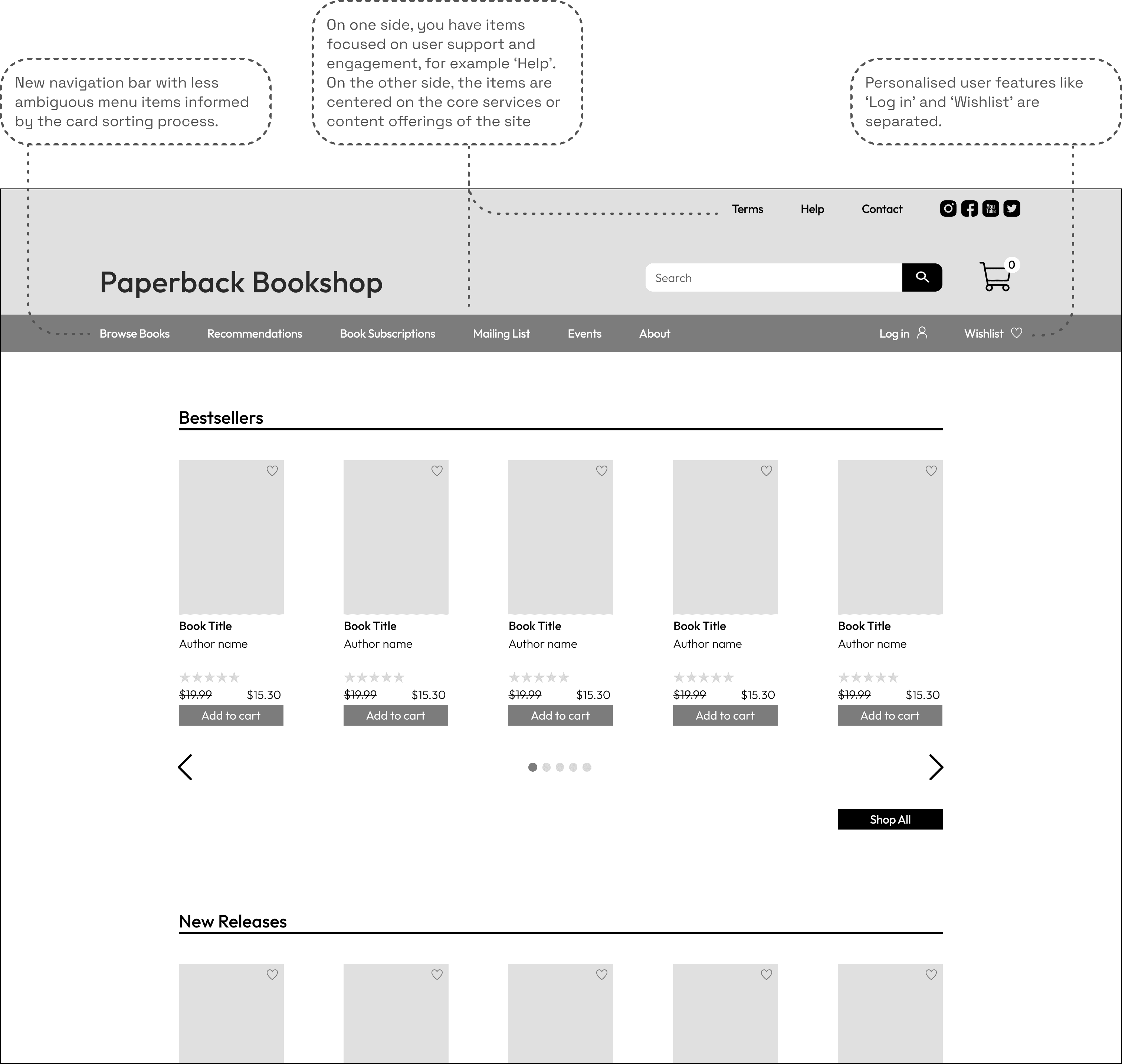
Homepage
This is new homepage with a new navigation bar at the top, the changes I have made are detailed in the annotations below.
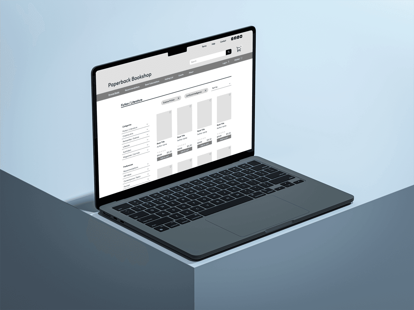
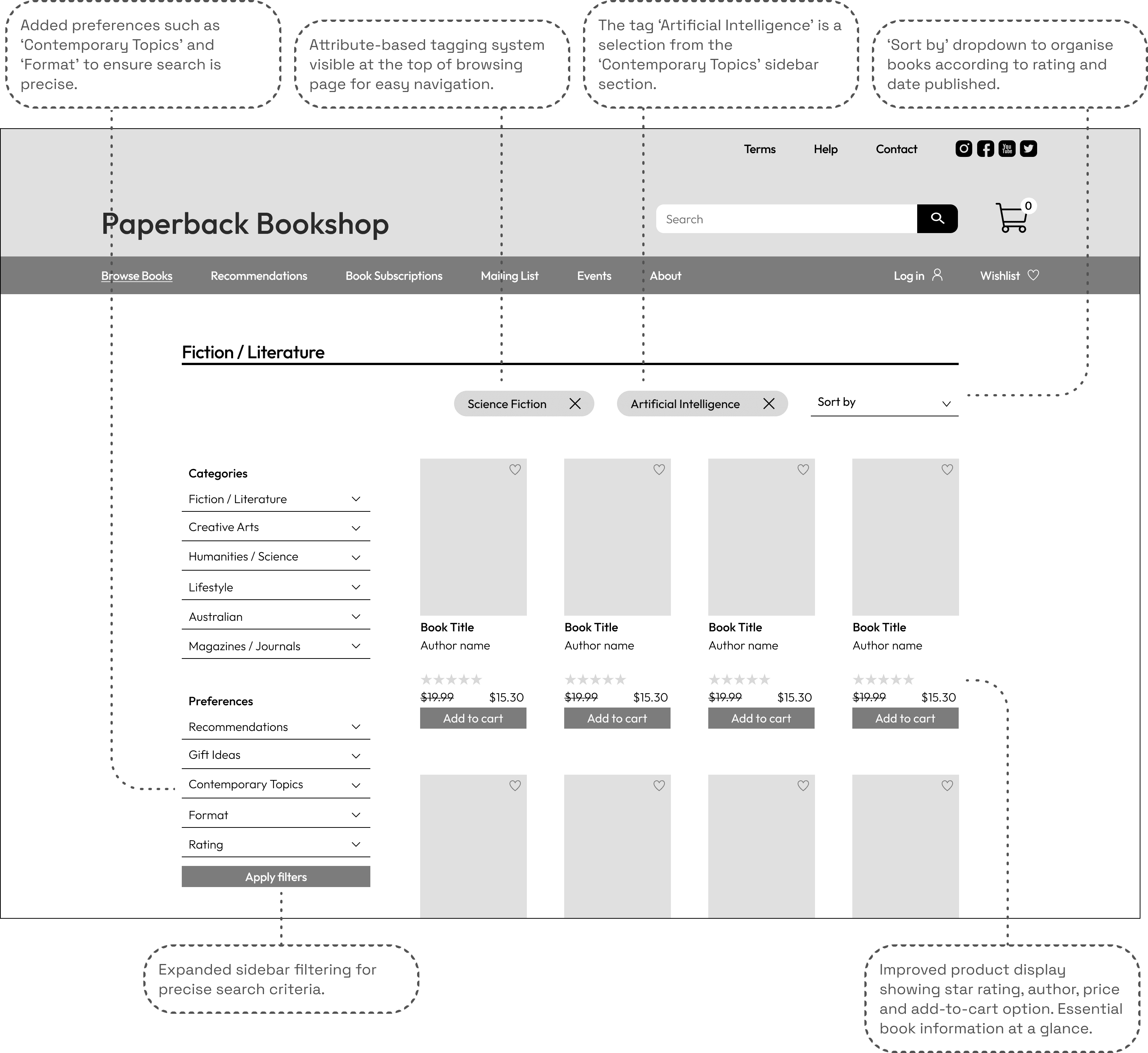
Browsing Books
The wireframe below displays the implementation of a new category system and various other changes to the current system for discovering books.
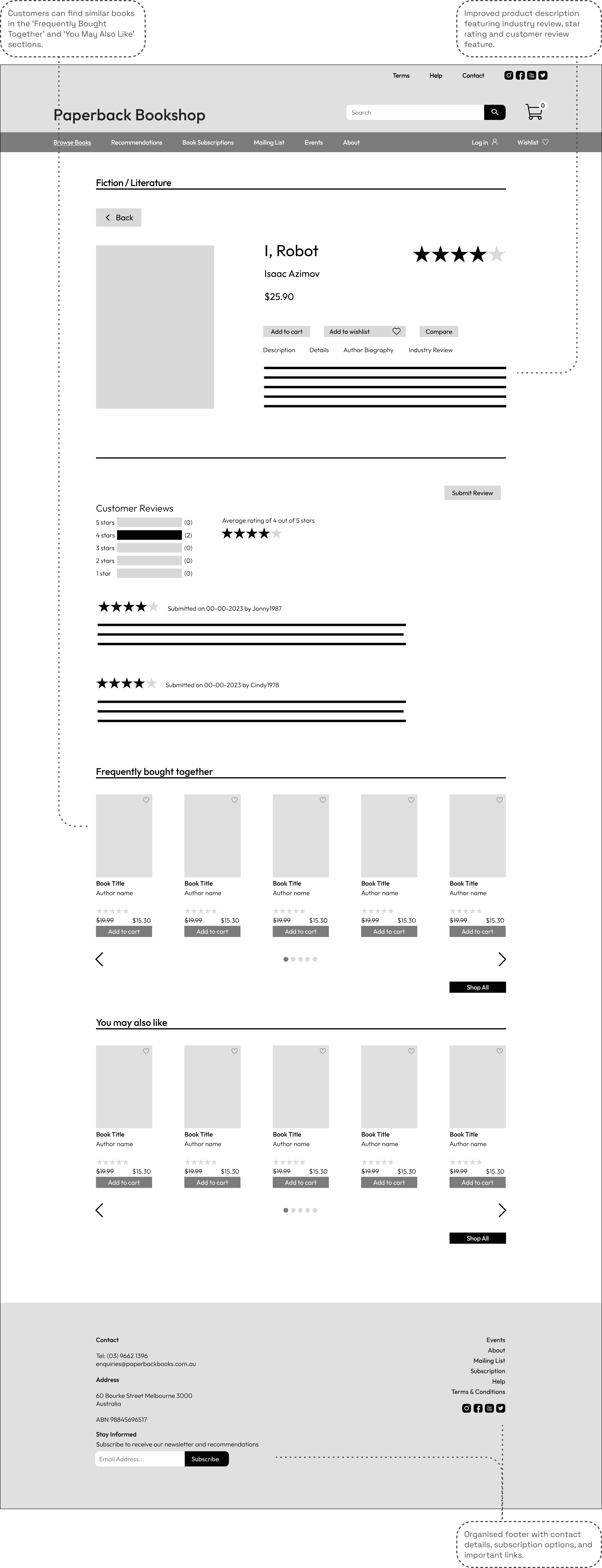
Product Page
The product page features much more detail now, including contextual navigation, user reviews and information about the author. This is aligned with the benchmark set by competitors.
Wishlist
The wishlist has been updated to support the quick comparison of titles the user is interested in purchasing.
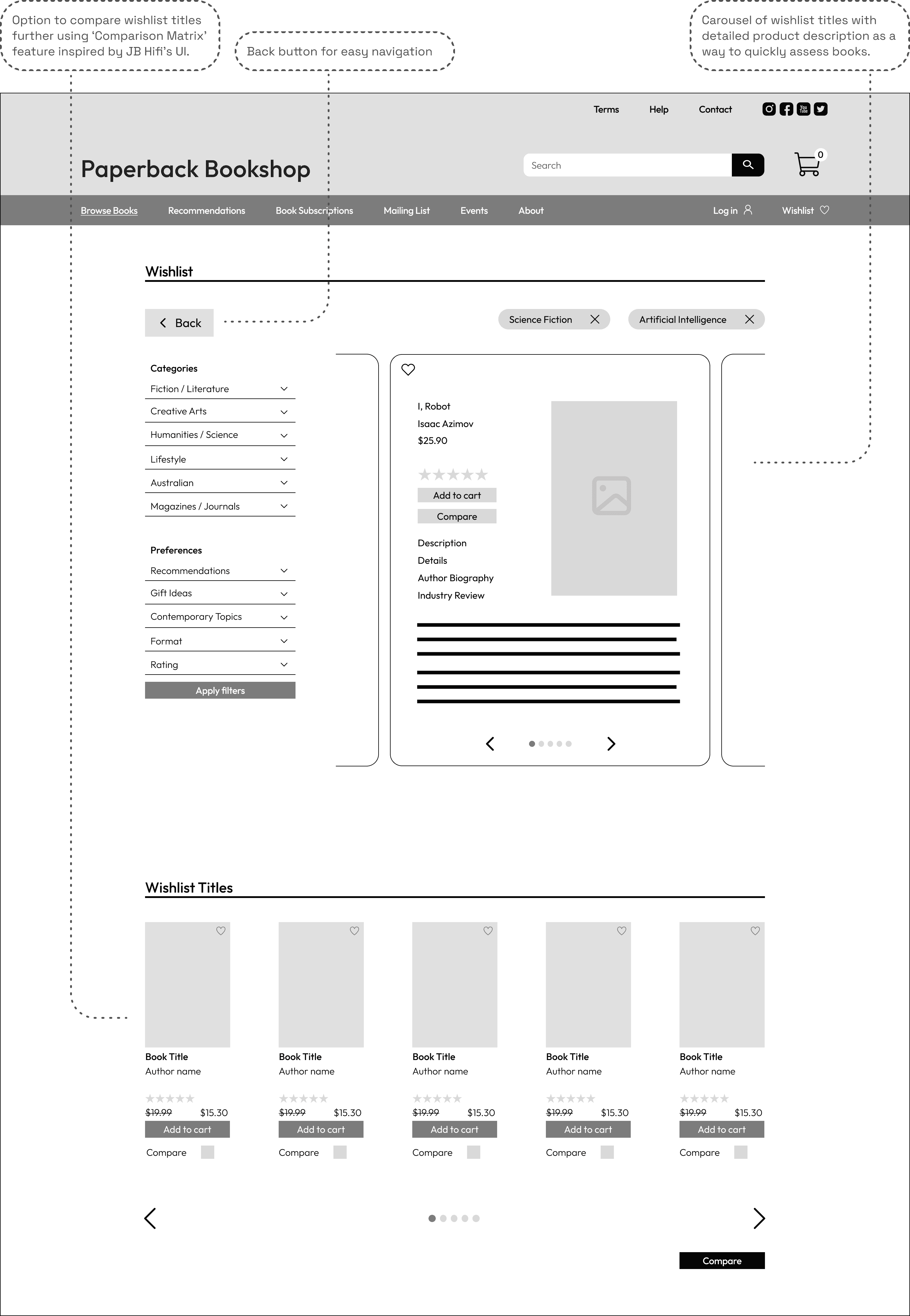
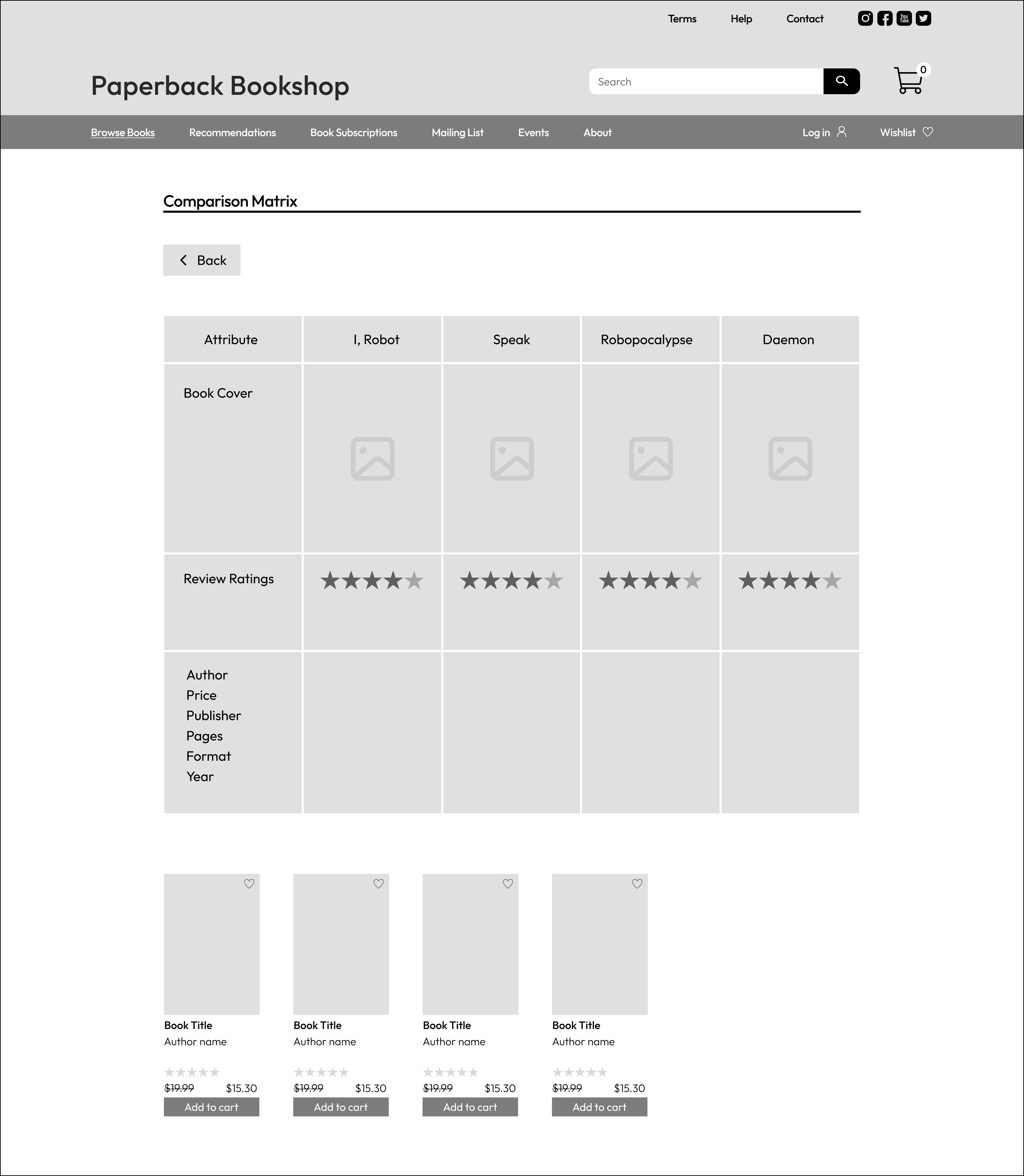
Comparison Matrix
The following comparison matrix has been developed, inspired by a similar UI feature on the JB-Hifi website. This is the perfect feature for customers looking the compare the attributes of multiple books, in order to make the best selection in terms of value or quality.
The Whole Process: Finding a Quality Book and Checking Out
The video below illustrates the whole process from discovering a book to checking out and purchasing the book.
Reflection
Since my early 20s, I’ve always loved visiting the Paperback Bookshop. Sometimes I would trawl through the shelves late into the evening, as it's often open until 11pm. It’s such a quaint and welcoming little book store. It was interesting to think about how such a unique space should translate to the digital realm. I also identify with the ‘careful critic’ archetype, and it was fun to think about how my own expectations would be more readily met in an e-commerce context. It was eye-opening to see how a web experience can completely change when a particular user-type is prioritised - and user interface elements that correspond with their preferences are identified and implemented. Overall, the project was a rewarding experience and I’m interested in learning more about e-commerce site design in the future.